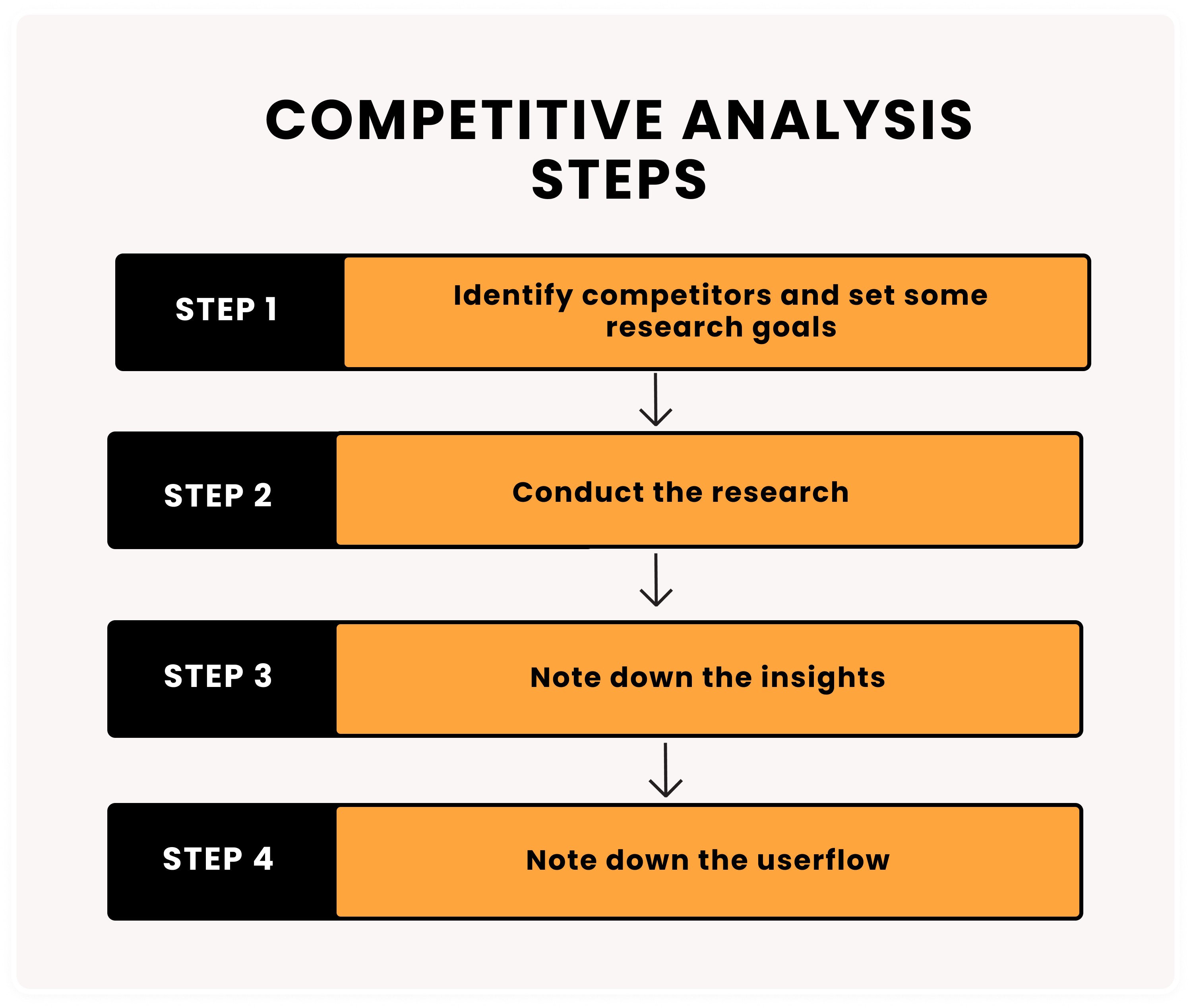
Product builders need to do thorough research and learn as much as they can about competition. Competitive analysis or competitive benchmarking is a UXR method to understand the current landscape and identify market opportunities. It means looking at products that are similar or act as inspirations to the one you’re building.
Why?
Use competitive analysis to:
Learn what to improve in your product or service
Identify industry gold standards
Look for strengths and weaknesses that a specific app or interface does very well that stands out above the rest
Save time by replicating how another team solved a problem
How?
Step 1: Identify competitors and set some research goals
Set goals: Identify what it is you want to learn. For example, if you’re designing the onboarding journey, then you might only need to explore the onboarding phase of the competitors you are analysing.
Identify competitors: Create a list of competitors. With 27 bitcoin specific products currently on the market, there are plenty of opportunities to learn from. Check out Bitcoin Products for inspiration.
Under each org, summarize your observations about them. Using a wallet example:
Custodial or non-custodial
Lightning only or onchain and lightning
Level of user maturity you’re targeting. This largely depends on the vision/strategy you have for your product.
Use competitive benchmarking to solve a specific problem by asking the following:
What specific area of the interface am I designing right now?
What part of the user flow are you getting the most questions about from users?
What sort of opportunities am I looking for?
Specific opportunities could be:
UI designs
UX writing, education, marketing
Interactions
User flows
Step 2: Conduct the research
If you’re using Figma, open the template file below to use in the research collection process. File -> Save local copy...' to create your own.
Download the apps of the competitors you have decided on in step 1
Take screenshots of every screen that you come across as you move through the specific section you wish to learn from.
a. This particular step is important as sometimes when you click on a button, the interface itself at that moment gives us feedback. This could be in the form of a confirmation message or an animation. Its critical that you screenshot every time there is a change to the screen state you’re on.
Place the screen states next to each other in Figma or your design tool of choice.
Use 3 different colours of post it notes to note down observations.
a. Yellow: Represents industry standards
b. Green: A strength of that competitor
c. Red: Things that can be improved.
Step 3: Note down insights
Now that you have used colors to represent the industry standards you can group the insights.
What will I do differently in my product?
What will I replicate in my product?
What will I avoid doing?
What’s a feature/ idea I’m backlogging for future inspiration?
You now should have some concrete product ideas and directions.
